- Why Most Brand Strategy Documents Fail (And What Actually Works)
- Why Pretty Branding Isn’t Converting (And What Your DIY Brand Is Missing)
- Your Logo Isn’t the Problem — Your Messaging Is (Here’s Why)
- Why Stepping Back Is Sometimes the Fastest Way Forward for Your Business
- Strategic Branding: Playing The Long Game
LATEST POSTS
I'm a neurospicy mom of two, chronic oversharer, creative polymath and problem solver. My superpower is looking at your biz holistically, spotting the gaps, and helping you fill them.
Read more.
hi,
I'm meaghan 👋
I was introduced to Ashleigh through our friend Francesca of @outsidetheshape – tbh, a founding place for many of my YYC business relationships. She stocked her pieces at the then shop in Inglewood, and years later reached out to me about a rebrand.
Her existing logo worked fine, but she was seeing growth in the business the brand didn’t necessarily match anymore. Rather than ready-to-ship pieces, she was taking on more custom work which also came with a higher price tag, and wanted a more refined brand to reflect that.
Ashleigh also emphasizes ethical sourcing and high-quality materials, creating pieces that can be passed down for generations.
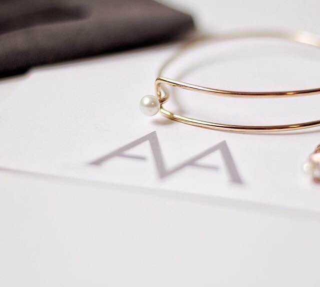
classic / luxurious / refined / calm

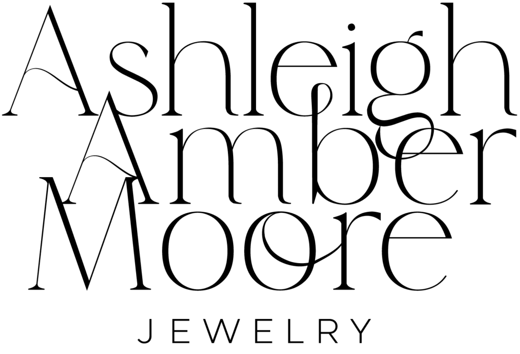
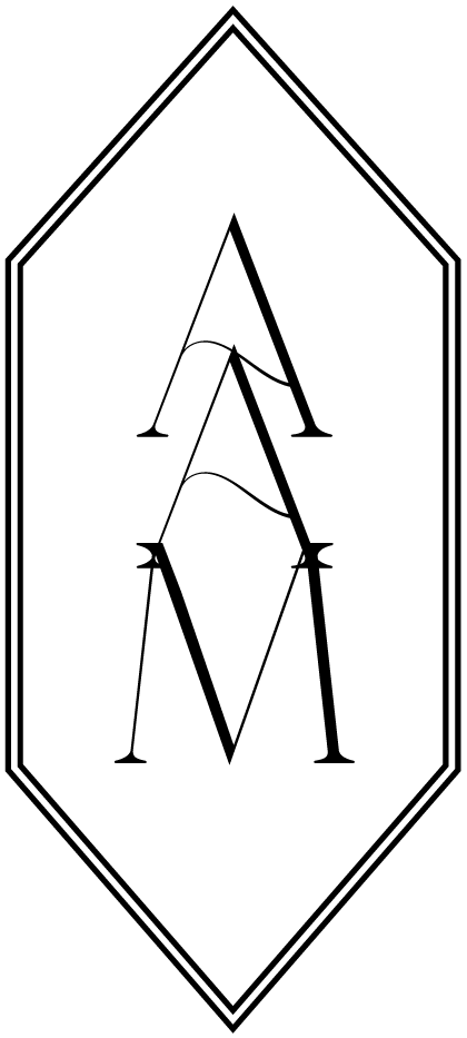
While we follow the One Concept Method, we like to provide clients with slightly different options for different placements – think more horizontal for narrow headers like on a website, or smaller logomarks for, in this case, a ring box.
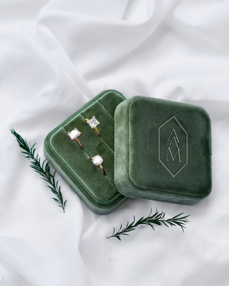
We usually present concepts with realistic mock-ups for their industry / product, and actually design these alongside the actual logos a lot of the time to ensure they execute in the real world. Patterns can be a fun element to add in a brand suite as well and are great for tissue papers.
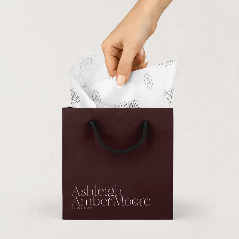
Thinking of the whole client experience includes digital – what will the website look like, social media, etc. This is where your colour palette can really come into play and get some fine-tuning.
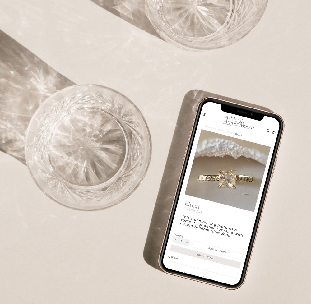
We gave Ashleigh Amber Moore Jewelry a more refined, high-end look to match her customized offering, and played into her design style with a moodier, almost art deco feel through intricate typography, colour palette and texture.
hi, I'm meaghan 👋
- Why Most Brand Strategy Documents Fail (And What Actually Works)
- Why Pretty Branding Isn’t Converting (And What Your DIY Brand Is Missing)
- Your Logo Isn’t the Problem — Your Messaging Is (Here’s Why)
- Why Stepping Back Is Sometimes the Fastest Way Forward for Your Business
- Strategic Branding: Playing The Long Game
LATEST POSTS
I'm a neurospicy mom of two, chronic oversharer, creative polymath and problem solver. My superpower is looking at your biz holistically, spotting the gaps, and helping you fill them.
Read more.
canadian, woman owned Branding studio 🇨🇦
Positioning-led brand strategy and visual identity for experts whose brand stopped keeping up somewhere around year two.
Comments
Comments